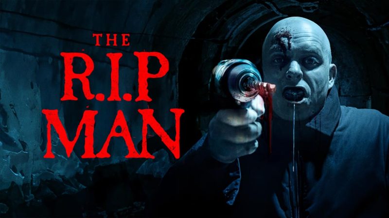
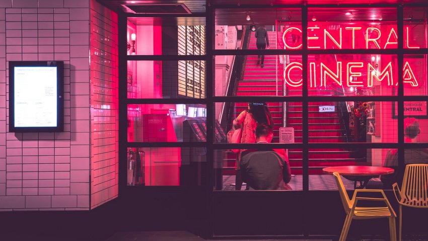
Some movies leave you thinking about the plot. Others are remembered with a single image.
It might be the deep blue hallway where a character finally broke down; the warm golden kitchen that felt impossibly comforting; or the flash of crimson that made your stomach drop before anything happened. Those moments stick because color reaches us faster than words. It slips past logic and goes straight to emotion.
That’s why beautiful shots are only half of what cinematography does. Every shade in the frame can change how we read characters and an entire story overall.
Color Is the First Emotional Cue
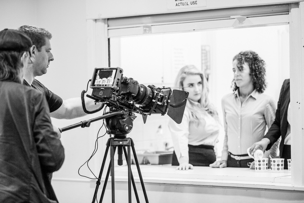
The human brain processes visual information almost instantly. It means you’ve already absorbed the mood of the scene through its palette before you consciously register facial expressions, lines of actors, or plot changes.
That’s the reason cinematographers obsess over details many viewers never notice. The walls, wardrobe, practical lights, and even the weather outside a window are carefully chosen to support the emotional story.
A hopeful scene is written and then lit to feel hopeful. Heartbreak works the same way. Cooler tones, reduced saturation, and softer contrast can make a room suddenly feel empty, even if nothing about the location has changed.
Finding Inspiration Beyond Film
Many directors borrow ideas from different sources, such as psychology, mythology, nature, and even spiritual traditions, before deciding what the final movie’s picture should depict. The main goal is to create visuals with a strong emotional weight.
Creative research often stretches well beyond film textbooks. Resources like asknebula.com deliver insight into symbols, archetypes, and cultural meanings, exploring which can spark fresh visual concepts for artists. Even when directors don’t use these literally, they often influence the atmosphere that audiences instinctively respond to.
When Symbolism Shapes Visual Storytelling
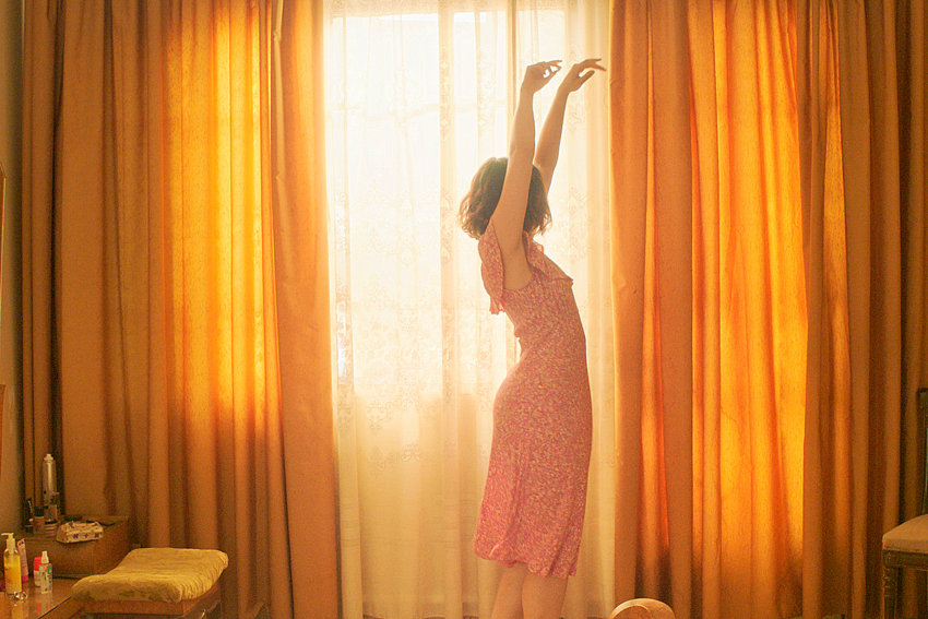
Color often gets more power when paired with specific symbols. Take jumping spider symbolism. In many interpretations, that tiny hunter represents patience, precision, adaptability, and knowing when to act.
A filmmaker doesn’t need to show a spider for those ideas to impact a scene. A restrained color palette, balanced compositions, or earthy tones may echo the same ideas without a single spider on screen.
What Red Means Depends on the Scene
Red grabs our attention faster than almost any other color. So filmmakers are used to reserving it for emotionally charged moments, but not always the same kind of emotion.
A romantic drama may fill a candlelit restaurant with deep reds that suggest intimacy and desire. A psychological thriller might use the same color to hint that violence is only minutes away. Context frames the meaning, not the color alone.
The Many Moods of Blue
Blue is usually associated with sadness. That’s only part of its personality, which can also cover peace, reflection, loneliness, trustworthiness, or a strange sense of comfort.
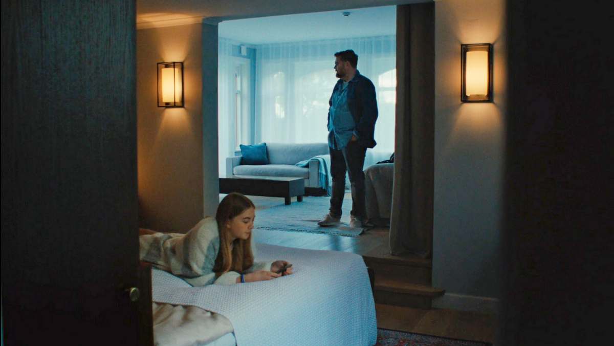
Depending on the genre, a different side shows up. A cool-blue palette prevails in science-fiction films to emphasize futuristic technology or emotional detachment. In contrast, family dramas might use soft blue evening light to create slow, tender moments between characters. It’s the same hue, with a completely different emotional effect.
Yellow Can Feel Wrong
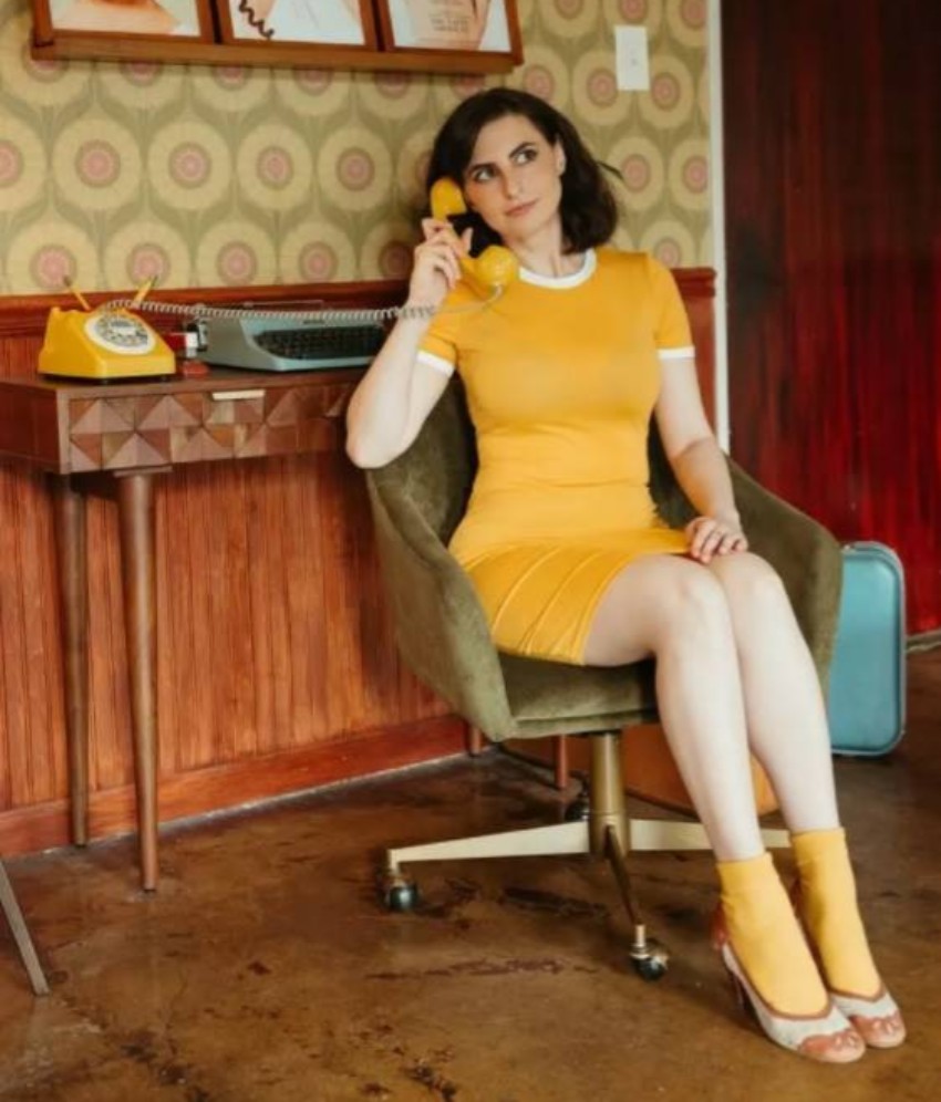
Yellow naturally signals warmth and optimism. At the same time, this color soaks some of the most unsettling scenes in modern cinema. Directors flood scenes with bright yellow precisely because it creates subtle tension. The audience senses something is off, even if everything looks cheerful on the surface.
That uneasy contradiction works especially well in psychological dramas, where appearances matching reality are rare. The discomfort arrives before viewers understand why.
Green Lives Many Lives
Green might be the most flexible color in film. Place it in a sunlit forest, and it symbolizes ambition, temptation, or renewal. Switch the setting to the sterile hospital corridor, and it turns cold, clinical, and alarming.
Everything surrounding the color creates the meaning. That explains why cinematographers rarely think in isolated shades. They’re building relationships between colors, locations, costumes, and light.
Color Palettes Grow With the Characters
The smartest technique in great cinematography is the ability to change the entire palette with the story unfolding. A coming-of-age movie might begin with muted tones and gradually introduce richer colors tied to the protagonist’s growing confidence.
Other stories do the opposite. A vibrant world slowly fades into colder blues and grays as hope disappears. The shift feels natural because it’s emotional before it’s visual.
Many viewers couldn’t point to the exact moment the palette shifted. Yet they’d still describe the ending as darker, lighter, or somehow more hopeful. That’s no accident.
Why Some Frames Linger
Ask someone about their favorite movie, and they’re more likely to describe specific visuals before quoting lines.
A silhouette against an orange sunset, rain shimmering under neon lights, a child in a bright yellow raincoat surrounded by a world of gray. Those images stick in memory because they express things words can’t quite capture. That’s the true magic of color psychology in cinematography.
Next time a scene stays with you, try naming its three loudest colors, then ask what you were feeling while it played. The answer usually says as much about you as it does about the film. The same attention works away from the screen: notice which colors you reach for on a hard day, or what you’d paint a room you wanted to feel safe in. If you’d like to explore what those images mean for you, Nebula’s self-discovery readings and symbol guides are there whenever you want them.
You can comment below
INDIE ACTIVITIES